The Warmth
of Sore Hari.
Chapter.
What began with the spirit of an izakaya — lively, playful, and full of energy — has grown into something more enduring.
Not louder, but deeper.
Not busier, but more considered.
SORE today is a warm, everyday comfort brand. Built around simple things done right: ramen, toast, coffee, and dessert — and the kind of moments people don't rush through, but return to.
The gap
we choose
to own.
Ramen Shop
Built around meals — structured, occasion-based, and often limited to that single experience.
Cafés
Offer space to stay, but rarely satisfy beyond drinks.
Dessert Spots
Fleeting. Quick, indulgent, and short-lived.
Chains
Prioritize efficiency, but lose the sense of warmth and connection.
SORE exists in the space between.
A place where meals meet moments. Where you can come for a bowl of ramen, stay for coffee, share a toast, and end with something sweet.
Not limited by category.
Just complete comfort, designed to fit into your day, and easy to return to.
Four things,
every time.
Good Japanese Comfort
Consistent ramen, bowls, toast, coffee, and desserts that satisfy every time.
Fair Prices
Easy to say yes to today. Easy to repeat tomorrow. No second-guessing required.
Genuine Hospitality — Omotenashi
Warm, attentive, not scripted. Guests feel seen — not processed.
Simple Reasons to Return
Enough variety to stay interesting. Clear enough to never feel confusing.
Omotenashi,
always.
SORE is a Japanese comfort dining space that brings the calm and warmth of sore hari into any time of day, through thoughtful food, familiar flavors, and a space that invites you to stay.
We don't compete on authenticity, craftsmanship, or trendiness like any other Japanese restaurants out there.
Always-on urbanites
Urban individuals who are constantly "on" — looking for a place to slow down, reconnect, and feel grounded.
Life is loud
Life is fast, loud, and demanding. People crave a little pocket of calm.
A softer hour
Provide a place where time feels "softer," just like sore hari.
- ·Comfort-driven menu (ramen, coffee, toast, dessert)
- ·Warm, grounded, non-performative space
- ·Flexible for any time of the day
Narrative
The warmth
of SORE.
SORE is not only about time, it's a feeling. At SORE, we serve more than meals — we serve the warmth of sore hari, through a lens of Japanese comfort dining, inspired by the quiet charm of kissaten.
A space where time softens, whether it's morning, afternoon, or night.
Should
feel like this..
Warm
Genuinely kind. Makes people feel welcome without making a show of it.
Smart
Thoughtful choices. Nothing is there without a reason.
Relaxed
No pressure. No performance. Just easy, honest hospitality.
Reliable
Guests know what to expect — and it always delivers.
Quietly Cool
Not loud. Not trying too hard. The kind of small place regulars like knowing about.
Never trying too hard, never in a rush.
Never rush the message
Short sentences, natural pause, no pushing language.
Warm and Kind
But not overly sweet, soft, or cheesy.
Not Performative
Simple, present, not trying too hard to be aesthetic — describe what it is.
Inviting
Don't chase people, make space for them.
We don't say..
- Best / number one
- Premium / luxury
- Authentic (overused)
- Hurry / now / limited
- Overly slangy words
The Key Message
A simple way to keep everything we say consistent,
to make people feel & remember SORE.
The warmth of SORE
is not just ambience.
It is the feeling of good food, fair price, and genuine hospitality coming together in a small upstairs/humble place
Warmth in the food
Ramen, coffee, toast, desserts
as different comfort moments.
Warmth in the service
Omotenashi, small gestures,
genuine hospitality.
Warmth in the return
Fair price, easy choice, hidden
upstairs worth coming back to
How we bring
that feeling to life,
consistently.
Moment of SORE
Relatable content (could be outside SORE) to build emotional connection
Your Kind of Warmth
Menu, product, SORE storytelling. To build relevancy: different mood → different kind of warmth. Here's to make SORE more personal.
Stay in SORE
Capture the ambience, the vibes, the service, the people. They come here to stay, not only for the food. “The feeling of being here at SORE”
Warmth to Share
Promos / offering to add reason to come to SORE, wrapped in a message that people relate to / shareable quotes.
The Logo.
Primary Mark
Horizontal Mark
Digital & Print Usage
— Digital Minimum
— Print Minimum
Color & Codes
RGB 56 · 26 · 5
HSB 24 · 90 · 21
RGB 136 · 65 · 30
HSB 19 · 77 · 53
RGB 97 · 108 · 36
HSB 67 · 66 · 42
RGB 162 · 136 · 75
HSB 40 · 53 · 63
RGB 206 · 135 · 21
HSB 36 · 89 · 80
RGB 202 · 159 · 145
HSB 14 · 27 · 79
RGB 148 · 170 · 178
HSB 194 · 16 · 69
RGB 234 · 232 · 201
HSB 55 · 13 · 91
The Typography.
The Display Voice
The Working Voice
How they work together
The Warmth of SORE
SORE is not only about time, it's a feeling. At SORE, we serve more than meals — we serve the warmth of sore hari, through a lens of Japanese comfort dining, inspired by the quiet charm of kissaten.
A space where time softens, whether it's morning, afternoon, or night.
Visual Identity.
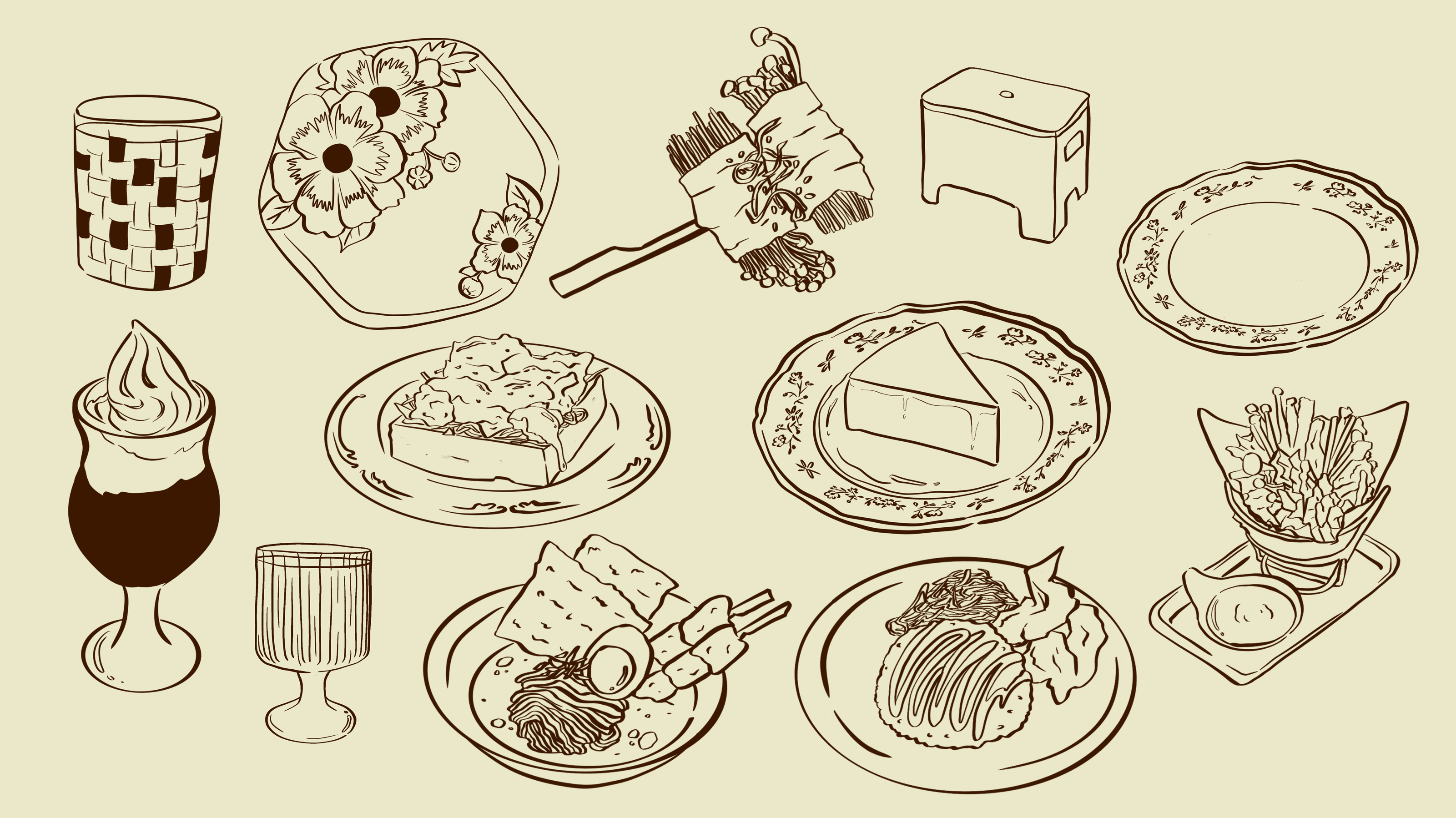
Illustration Set
Key Visuals
- Natural light (window, soft shadow)
- Earthy palette (brown, wood, cream)
- Human: relaxed, not posed; avoid eye contact
- Feel like a quiet, comfort, real moment
Surfaces of SORE
Wooden texture
Dark brown, not yellowish. Grounding, warm, never sharp.
Brick
Used as background or detail. Lived-in, not industrial.
Fabric, linen texture
Neutral earthy color. Soft, breathable, unfussy.